The "QT clock" conceptby Alex page, MS. |
|---|
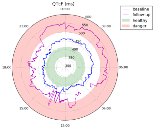
Prolongation of the QTc interval is known to occur during different activities or times of day depending on LQT genotype [1]. Holter recordings are therefore essential in capturing the full scope of a LQTS patient's QTc variation. Further, differences in age, gender, or therapies can make it difficult for a clinician to judge whether a QTc measurement is “normal”. To address these issues, we have developed the “QT Clock” method, which provides a visual representation of a patient's QTc throughout the day (in reference to the expected range for similar or healthy individuals). The clock is a polar plot in which the angle represents time of day and the radius is QTc. An example is given here:

This plot shows QTc over two Holter recordings of a male LQT2 subject. The baseline (blue) was recorded at age 3, and the follow-up (magenta) at age 5. The red region simply highlights QTc>500ms, a typical warning range [2]. The green region is more dynamic; it is defined as the 5-95 percentile range of QTc, minute to minute, for the 100 healthy male patients in the THEW E-HOL-03-0202-003 database of the THEW.
To generate the data sets for the plot, including the green “healthy” range, we used an automated annotation algorithm to provide the time of QRS onset, R, and T end for all beats on all leads of our Holter recordings [3]. QTc was then computed beat-to-beat using the median RR and the longest QT across all leads. Values in the neighborhood of ectopic beats – which were flagged by the same annotation software – were discarded. Finally, outliers were removed using a median filter, though we note that in the second recording there was still noise around 1-2PM even after this filtering.
This example reveals that 1) checking the patient's baseline QTc against a static value like 450ms would not have indicated LQTS during the day. In other words, a full Holter recording was necessary to detect prolongation.
2) The difference between the 24-hour baseline and the green region is very obvious. This presentation – the QT Clock – is much more intuitive for clinical use than a brief statistical summary of QT annotations.
3) This patient's QTc has increased dramatically throughout the day in the second recording compared to the baseline, to dangerous levels.
4) The asymmetry of the plot is very typical of LQT2 patients [4], which could allow for diagnosis even before genetic testing is performed.
References:
[1] P. J. Schwartz, S. G. Priori, C. Spazzolini, A. J. Moss, G. M. Vincent, C. Napolitano, I. Denjoy, P. Guicheney, G. Breithardt, M. T. Keating et al., “Genotype-phenotype correlation in the Long-QT Syndrome: gene-specific triggers for life-threatening arrhythmias,” Circulation, vol. 103, no. 1, pp. 89–95, 2001.
[2] S. G. Priori, P. J. Schwartz, C. Napolitano, R. Bloise, E. Ronchetti, M. Grillo, A. Vicentini, C. Spazzolini, J. Nastoli, G. Bottelli et al., “Risk stratification in the Long-QT Syndrome,” New England Journal of Medicine, vol. 348, no. 19, pp. 1866–1874, 2003.
[3] Y. Chesnokov, D. Nerukh, and R. Glen, “Individually adaptable automatic QT detector,” in Computers in Cardiology, 2006. IEEE, 2006, pp. 337–340.
[4] A. Page, M. K. Aktas, T. Soyata, W. Zareba, and J.-P. Couderc, “The “QT Clock” to improve detection of QT prolongation in Long QT Syndrome patients,” Heart Rhythm, 2015. [Online]. Available:
http://www.sciencedirect.com/science/article/pii/S1547527115011273